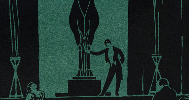
Bibliographic coding in the first issue of "The New Age"

Bibliographic coding, according to George Borstein, is connected to Walter Benjamin's concept of  "aura." He uses it to mean distinguishing features of a work (page layout, typeface, etc) that emphasize the work's "presence in time and space." In the first issue of "The New Age," the reader is struck by its similarity in appearance to a newspaper: black sarif font on white paper, with headlines in larger, bold print. There is no cover, per se. The front page includes the title of the publication, the date, its cost, and on the upper right and left corners, placed around the title that calls itself  "an independent socialist review of politics, literature and art," we find small boxed advertisements - one for coffee, another for bread.

There is no table of contents; rather, the first two pages consist of a lengthy article addressing politics, wherein the sections are headlined with subheadings in bold capital letters (one assumes these are written by one or both of the editors, as there is no signature). On the third page, we find letters to the editor (again reminiscent of this type of section in a newspaper). Throughout this issue, scattered among the poetry, reviews, and essays, we find advertisements for lectures, books, and food.

The nature of what is advertised seems to underscore the socialist angle of the magazine - everyday food staples along with intellectual writings and lectures, the simple needs of an everyday socialist. Furthermore, the likeness of the magazine to a newspaper adds a perception of authority to what is said within its pages. The first two pages basically lay out an analysis of the current political situation in Britain, providing a framework through which the reader can then view the contents following it. The impression of authority given by its layout makes the reader less inclined to question the merits of what is being said within, and more inclined to allow the editors and authors published in "The New Age" to set the terms of the debate.

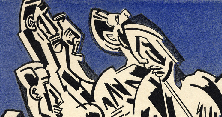
Bibliographic Coding

The Bornstein reading discusses different theories of construction in a literary context.  Not only is there a linguistic code which focusses on the words and content of the pieces, but there is also a bibliographic code.  Bibliographic code refers to how the content is presented to the reader.  Borstein describes that this could be spacing, cover design, or page layout.  It affects how the words are delivered the reader and how they are interpreted. For example, if a piece is spaced in a certain way, that affects how it is read.  The spaces can cause the reader to pause in certain places and that puts emphasis on certain words and phrases.  Page layout can also affect how literature is processed by an audience.  If it is designed in a certain way the eye may jump across the page in different patterns of visual flow charts. 

For example on page 10 in issue No. 1 of "Blast," there is a different font used down the page.  This emphasizes the words in different ways.  Having the words capitalized or bolded makes certain phrases stand out compared to others.  For example, the word automobilism is bolded and capitalized.  This draws extra attention to it and makes what follows after it comparable to a definition.


Post 1- Bibliographic Coding in BLAST

I've chosen to look at the first issue of BLAST and just by looking at the cover, I've realized how different the bibliographic coding for the journal is looking at it on the web is versus having the copy that was scanned to produce this digital copy. The front cover and the back cover are two entirely different shades of pink. The front is very faded, and it almost looks like it started out a red-brown color. Compared to the bright and shocking pink of the back cover, I would never have guessed that the two started out the same exact color. It makes me wonder what exactly happened to the front cover, and perhaps having the physical copy for bibliographic coding would lend me more of an idea. It almost looks as though something spilled on the front cover. The binding is held together by what looks like old masking tape and both covers have rips and the pages are curled under. In the sense of experiencing the wear and age of the document, I scarcely connect with it through the digital version whereas I think I'd get a strong sense of it if I had the actual physical copy in my hands. 

Delving into the text, I notice that the printing of the letters and images in the issue appears to be inexact. For example, there are spots where there are extra dots of black on the page, like on a page towards the beginning where it says MANIFESTO. and there is an image of what looks like a jousting weapon. Around the image, there are imperfections in the printing which I only noticed because I looked carefully for them and zoomed into the document from its default view on my computer. Likewise, scrolling two pages down to the page that begins BLAST First (from politeness) ENGLAND, I notice that just by looking at the letters A on the page and comparing them to one another, some of them have the triangle part on the top filled in while others are open to reveal white paper. There are also some spots in the black letters where white dots show, revealing more imperfections in the printing. This bibliographic coding is difficult to obtain and understand in the digitized versions. Had I not been looking closely, I would not have noticed it. Browsing through digitized versions is a very different experience from looking at a physical copy of something. It certainly changes the bibliographic coding as Borenstein mentioned when comparing King Lear originals to reprints. I wasn't so convinced that the experience would be very different from looking at a scanned version of BLAST and a physical copy, but now that I've examined it closer, I've come to a different conclusion. I'm sure this will be further evident after visiting the special collections to see a copy in person. 

Differences in the BLAST issues

 I couldn't help but notice the initial visual experience that exists, even in an archived copy, of the first issue of BLAST. Lewis's obsession with pure, abstract energy is evident in his own vorticist artwork, the typeface of "Manifesto--I," and the cover design itself, whose offset block-letter "BLAST" screams off the hot-pink backdrop that seems to glow from its own radiating energy. 

However, much of Lewis' energy seems lost after the excitement of the first issue, both in content and the somber subject of the War itself. In his editorial, Lewis recognizes the effect of the war on Europe, but insists that "art should be fresher for the period of restraint." And although this issue has most of the same contributors, the lack of physical content alone shows their exasperated inability to keep up with the previous issue (with the exception of Lewis, who contributes a greater portion) but also in the more traditional typeface, and especially in the cover. Gaudier-Brzeska says it best in his "Vortex": "IT WOULD BE FOLLY TO SEEK ARTISTIC EMOTIONS AMID THESE LITTLE WORKS OF OURS." The drama in Europe, as this issue's contrast to the last shows, is not playing out on the artistic stage, but on the battlefield. As a result, BLAST's second issue cannot mimic the energy of the first, but instead adapts the aura of the era.

Bibliographic Coding in BLAST

In Bornstein’s piece we learn that “the bibliographic code corresponds to the aura and, like it, points to the work’s ‘presence in time and space’”. He states that bibliographic code is found the page layout, book design, the typeface, and the boarder of the page.  Within a work’s bibliographic code a reader is able to see the “aura” of the piece.  In Wyndham Lewis’s BLAST No. 1 the bibliographic coding speaks loudly.  That is that when readers look at the magazine they can’t help but notice the bold, bright color of the cover, with the word BLAST clearing standing out.  Lewis is already drawing readers to his work before they even open the cover.

On page 59 the piece titled ENEMY OF THE STAIRS. has an interesting form of bibliographic coding.  The piece starts of in all capital letters and a little over half way down the page the text switches back regular capitalization and a smaller font.  He seems to be describing two different characters and is creating a higher level of importance for his first character by using all caps.  After reading about the first “manish” character, readers are less enthused by the “appalling gamin” character because of the way the description is laid out on the page. 

Bibliographic coding can completely transform the way that readers look at a certain work. By changing the text and capitalizing certain words readers are able to gain a sense of what the author thinks we should stress more importance on and in doing so get a greater read of the story.

Welcome!

Welcome to our course website! Normally I post this video as an introduction to modernism, but since our primary source just created an introductory video, I'll embed that instead. You should feel free to write a comment on this post to introduce yourself to the rest of the group.

Be sure to look through this site to see the kinds of work that students have done in the past. We'll be adding to the body of knowlege they've started to create as part of the process of highlighting and analyzing materials for the emergent field of modern periodical studies.

Welcome To the Course

It was great meeting all of you today, and thanks for taking this course. When you have a chance, please log in to the course website with the username and password that was emailed to you individually. There are two things you should do right away:

  1. Change your password to something you'll remember by clicking on the "My account" link (in the right sidebar below your name) and then on the Edit tab. Enter a new password and click on the Save button.
     
  2. Write a comment to this post letting me know that you were able to log in and change your password. Click on the "Add new comment" link below.

We'll cover more website basics in our computer lab meeting on Wednesday. See you tomorrow!

For Monday 7/14; Tech Workshop Requests

I just want to say that yesterday's presentations did a good job of bringing out the conflicts and contradictions in your respective aspects of The New Age. There was some good analysis as well as the exposure of some potentially fruitful points of research. For Monday, we'll hear from the two groups that still need to present and will then discuss Ardis, Morrisson and Bornstein. This will wrap up our study of The New Age and bring us into the wider world of avant-garde magazines and cultures. Our reading for Thursday 7/17 will consist solely of what you bring to the table in your readings of the other magazines at the MJP.

You'll also notice that I've changed the Descriptive Bibliography assignment to remove the presentations and place a focus on what values your magazine ascribes to the literary. This will form the background of our discussion on Thursday. Much information might be found in the MJP’s introduction to the journal you’re studying, in the Essays section, and in the Biographies area. Those interested in further research can check out the Books and Periodicals Database. I've added more practical information to the assignment page, so please do read it over again.

Also, since some of you expressed interest in technology workshops, use the comments here to (1) make requests, (2) indicate your availability, and (3) say whether you primarily use a Mac or a PC. I'll find out what facilities we can use at Brooklyn and will set something up.

Have a great weekend!

Pages