Rhetorical Analysis of Race in Modernist Magazines

            Like feminism, the topic of race also had a large impact on modernism, and this is evident within both Coterie no. 4 published April 1st, 1920, edited by Chaman Lall and in The Wide World Magazine vol. 25 no. 146 published June 1st, 1910, edited by Andrew Pitt-Kethley. Through the entries “An African Love Song” by Charles Beadle and “Travel and Adventure on African Borderlands” by Lieut.-Colonel R. G. T. Bright, C. M. G., of the Rifle Brigade, it is evident that there was mixed reception to those with a darker skin tone or of different culture. By showing the culture of Africans, these articles embrace the different culture, but diction choices bring into question the sincerity of these praises.

            Charles Beadle describes infatuation using African related similes that can feel awkward and R. G. T. Bright describes his positive experience in Africa using degrading diction at times. As he describes a woman’s beauty, Beadle compares her body to “a young giraffe” or even “small ant-hills,” which are understandable, but makes the reader feel uneasy (Beadle 21). Comparing beauty to nature is not a new concept, but typically animals or anthills aren’t used in these similes. These objects of comparison are generally not though of as beautiful which makes the comparison awkward on top of the feeling of cultural appropriation. R. G. T. Bright, on the other hand, describes his experience in Fort Portal “memorable” and how he is thankful for the experience, but he also mentions how the ceremony was “semi-barbaric” and one fashion style as “grotesque” (Bright 169-172). While Bright does appreciate the culture and is thankful for the kindness he was offered, his more offensive word choices counteract his previous praise. The environment and culture of Africans was curiously shown and could have been sincere if some diction was chosen to be less offensive.

Works Cited

Bright, R. G. T. “Travel and Adventure on African Borderlands.” The Wide World Magazine, 1 June 1910, https://modjourn.org/issue/bdr472761/

Beadle, Charles. “An African Love Song.” Coterie, 1 April 1920, https://modjourn.org/issue/bdr456288/


Feminism in The Masses

                 Feminism had heavy influence on modernist works and this is evident even in magazines that are not specifically targeting this subject. While The Masses mainly tackled worker’s rights and socialist problems, it also has feminism in some of it works. Notably, The Masses vol. 1 no. 12 edited by Horatio Winslow published December 1st, 1911, and The Masses vol. 4 no. 10 edited by Max Eastman published Augus 1st, 1913. In vol. 1 no. 12 of The Masses, Winslow writes his own piece titled The Cheapest Commodity on the Market where he talks about how women are unfairly treated as exchangeable goods. After describing how jewels may be fine but serve no practical uses, Winslow claims how women are “the cheapest commodity on the market. You can buy ten women for the price of a good ruby” (Winslow 5). This argument is justified through logos for it is logical that rubies serve no practical purpose and that women can do more than rubies. Yet rubies are valued higher and held with more respect than women despite the differences. Even in vol. 4 no. 10 of The Masses, there is a poem title Any City written by Louis Untermeyer that similarly shows how women are objectified without trying. He describes a woman casually walking but she is “[l]uring, without a lure; She is man’s hunger and prey – His lust and its hideous cure” (Untermeyer 25). Though she is just walking, she cannot escape the judgements of a patriarchal society and how men see her as an object for desire. This compares similarly to the aforementioned ruby, but the tone here implies the immorality of this mindset. While both pieces of media explain it differently, both of them shun the idea of objectifying women into expendable scrap.

Evaluating The Chastity of Women in The Egoist

In Vol. 1 No. 3 of the Egoist (shown in February 2nd, 1914) there's an article in the Views and Comments section called The Chastity of Women, written by an unknown author. It is reviewing Christabel Plankhurst's book, The Great Scourge and How to End It. The book itself is about the "scourge" of syphilis and gonorrhea in London, usually spread through prostitutes. The book claims that one of the two ways to keep the "scourge" from spreading is to make men adopt the same sexual habits as women - that is, they should be chaste. I happen to agree with the review, which cites this fix as shortsighted and probably not that effective. The reviewer makes a wonderful point about how chastity is relative, and how "sex" takes so many different forms that it's ridiculous to expect everyone to follow a single one of them. While, technically speaking, forcing everyone to be truely "chaste" would solve STD spreading, it is a shortsighted solution. But the reviewer doesn't seem very interested in discussing the realities of trying to enforce such a policy, or the potential issues that arise when both sides of a then-typical marriage (that's expected to result in a few kids) have no idea what they're doing (or, at least, have all their experience second-hand from literature and gossip). Instead, the reviewer quickly devolves into an objectively interesting discussion about purity in women and what "purity" even means and how it relates to women's relationship with men that does little to expand upon the original points raised by the author. In conclusion, though the reviewer initially writes down some excellent points, the review doesn't argue its claim very well; the lack of expanding on those points and the expansion into another area that (though related and interesting) doesn't do much to keep the review focused means that the review's argument is long, winding, and not very effective.

Evaluating, "Rebuke" in Good Housekeeping Magazine

In the text, "Rebuke" by L. H. W in the modernist magazine, "Good Housekeeping Magazine" Vol. 51, No 2, made in August first 1910 on page one hundred twenty-seven, it ineffectively displays a social situation in that time period. The passage briefly talks about how a old Clergy-men on the way back from a vacation is trying to help a thirteen or fourteen year old girl with boredom after they are being transported for over a day. In the text itself, it describes this benevolent clergyman, that could not bear this young girl looking out of a window for twenty-four hours by trying to give her something to read. It is a confusing message as the only thing that comes out of the story was the man asking,"Wouldn't you like something to read?" And then the girl obstinately reacted with,"She drew herself up stiffly."(modjourn). It is hard to describe the exact subtext of the story as it is so short, and the same time the actual message of the story. The author seems to be claiming that the Clergy men is being rejected from helping the girl even though he had good intentions. It could be assumed that the social context would be that a young girl by herself traveling is not a good situation for her, and that she seems to be distrusting of the clergyman. It is ineffective in it confusing presentation, and the shortness being a downfall of the story whether that be the author's fault or not, still hinders the narrative of the story as a whole. Maybe there is a underlying societal context that is needed to understand the text more clearly at a first glance, but looking at it through a more modern lens through the lack of knowledge makes it difficult.

Citation

“Modernist Journals: GOOD Housekeeping. VOL. 51, No. 2.” Edited by James Eaton Tower, Modernist Journals | Good Housekeeping. Vol. 51, No. 2, https://modjourn.org/issue/bdr472197/.

Evaluation of "Women's 'Rights'" by Dora Marsden

In Volume One, Number 19 of The Egoist magazine from October 1914, Dora Marsden argues in the article "Women's 'Rights'" that women are psychologically conditioned to believe that they are supposed to be weaker and lesser than men because of the patriarchy's grasp on women's minds. Marsden also argues that women's "rights" are not a thing because they should merely be human "rights" if any human has any rights at all (1). She claims that the war killed feminism because as soon as it started, no one was thinking about women's rights, rather, they were thinking about anyones rights. The war drew attention from the topic, and now it is forgotten about and barely anyone is fighting as hard for it anymore, and it caused people to believe that no one initially had "rights," and so arguing for women's rights was a moot point. Marsden believes that women see themselves as "valuable property," and a man's "possession" which causes them to adhere to the societal structure better and not rebel. Instead of being complacent, Marsden claims, women should use "physical force" to pry themselves away from the "womanly" label (3). 

Kodak Ad Summary

In McClure's Magazine, Vol. 17, No. 3, edited by Samuel Sydney, there is a two page ad for the Kodak camera on pages 47 and 48. The large size and relative simplicity of the ad draws the eye. The audience is drawn to look at the left side first, because of the more complex border and spacing. A picture of a lady in fine clothing holding a parasol is the centerpiece of the spread. Her picture is framed in a wreath of flowers, and the detail and framing means you look at her first. Right below her in very small font it names her as the Kodak Girl. Below that is a large, simple sentence - "Take a Kodadk with you" - that draws you due to its simplicity. On the bottom in small print is information on pricing and location of the company. On the right side, the first thing the audience sees is a proclamation in large, bold font on the superiority of Kodak products. Kodakery is in larger, orange font. Right below it in very small font it lists a little bit of information about the product and its film, but it still doesn't show very much. The same pricing and location information is on the bottom of this page as on the previous page.

Summary of Occident Flour Ad

      In the 1910 issue of Good Housekeeping, Vol. 51 No. 2, there is an ad for Occident Flour on advertisement pages 11 and 12. The advertisement is placed in the back of the magazine after the editorial content, and spans over two pages. On the first page, a large "C" shape encompasses the text, which asks the reader to show the ad to her husband, as well as using convincing language to convice the reader herself that she needs to try the flour. On the second page, a drawing of this exact action, a woman showing her husband the ad, is depicted, as well as a bag of Occident Flour outlined in bold black. The page also contains a coupon for a free bag of flour with no expense to the grocer providing it. The audience for Good Housekeeping is middle aged women, which the ad uses to its advantage by talking directly to a woman, telling her to show the ad to her husband. The text is scrambled throughout the ad, guaranteeing satisfaction with the flour at least 4 times on one page. Overall, the ad serves its purpose of getting people to try Occident Flour with its unique visuals and persuasive language.

Summary of a Coca Cola Advertisement from The Cosmopolitan Vol. 51 No. 1

In the magazine,"The Cosmopolitan" Vol. 51 No. 1 which was edited by Narcross C. P. there is a particularly alluring advertisement that in some ways show the influence between the actual content itself and the advertisements in that magazine. This magazine was created in June 1st 1911 and this magazine seems to be directed toward more of the middle class and their culture and mentality at the time. This is apparent as a lot of the editorial content describes people going into higher education, or about senators costing the taxpayer thousands of dollars. This becomes increasingly apparent in the advertising, but in this particular example, it is quite intriguing as this advertisement is about selling people Coca Cola. This advertisement, on page four, is a pleasant picture of a seemingly middle class woman talking with a middle class man at a what is called a soda fountain, which seems to be what an equivalent of a bar would be if it only sold soda beverages. It describes how it makes walks so much more enjoyable when people could take a break and have some Coca Cola. It is pleasant and welcoming in its presentation, with an air of cultural importance as in the background, many people are observing the two people having a pleasant drink. What relates this to the editorial content and its audience is the contrast between the advertisement and the content within and this becomes increasingly apparent with the intent and general message of the advertisement itself. This advertisement shows no regal persona in it, rather the people are casual, in their clothes and their general posture, but the people in the background seem to be very fixated on the two people in the forefront, as if in partaking in this beverage, these people in the forefront seem to be elevated culturally, which would appeal to the aspiring rich class that many of the other advertisements also do. This magazine seems to try to distract from the more chaotic time that these people where in to draw them in by showing how nice this moment would be with a soda product. This contrasts from the content of the magazine as it shows many stories of events that could impact their lives, or how they should quickly learn new skills to keep up with the ever-quickening pace of the Industrial Revolution. This seems to be placed so early in the magazine because it shows what seems to be a nice moment before all of rampant change in the times. That might make the audience want to go back to that moment in the beginning of the magazine and maybe have that beverage in a pleasant soda fountain.

Advertisement Summary

   In The Crisis, the advertisement "Atlanta University Stuides of the Negro Problems" by A. G. Dill describes a book filled with several articles relating to African American life. This clearly shows that the audience was African Americans which makes sense since The Crisis itself is targetted towards this same audience. Even the surrounding advertisements focus on the same topics as they pretain to "Negroes in New York" and a novel by W. E. Burghardt and Du Bois. Publications included within the collection are listed below the bold text to draw in those who can recognize the authors' names. The design of the ad itself is standard with the bold heading to draw the eyes and other details listed below that heading. It is notable that the borders of the ad are less interesting to look at than that of its surrounding advertisements. It has the vague form of the book but the advertisement to the left of it is even more so. While the ad is formatted standardly, it heavily caters to the audience that would read The Crisis and that may be all it needs to draw in buyers.

Cape of Good Hope

Had some trouble embedding image. Painting located on pg. 49. Cape of Good Hope, by Edward Wadsworth.

The title of this painting is Cape of Good Hope, which is the name of a rocky cape in South Africa. This is pretty clearly not a painting of a nature scene. The bold outlines, colorblock shading style, and inorganic curves and lines give a much more industrial feel and the clustered blocks almost give an impression of a crowded cityscape. This is an example of vorticism, which focuses around embracing the control and regularity of industry. While the painting may be cluttered, it still manages to not feel claustrophobic. The Cape of Good Hope has been taken over by technology, but it's not a bad thing, just a sign of progress.

Vorticism in BLAST

Vorticism is about rejecting Futurism but still embracing many aspects of industrialization. It also takes heavy influence from Cubism's structure. This piece's bold colors, rigid lines, and sharp angles all contribute to its Vorticism. As you look at it, you can find more sharp lines and edges which is most likely why it is name "Slow Attack." The blocks can also be seen to form winding stairs or buildings and furthering the idea of its Vorticism influence.

A insight into Vorticism in Blast's art piece," March" by Edward Wadsworth.

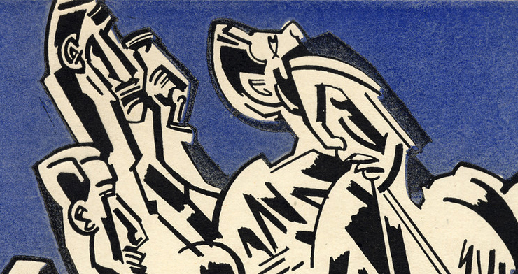
In the modernist journal, Blast, No. 1. A piece titled," March" by Edward Wadsworth, shows a array of abstract curved objects in what appears to be a dark place, with a small crack of light illuminating the otherwise dark place. It almost looks as though the objects are alive in some ways as they curve and distort. It gives the feeling that the objects in the piece are almost trying to reach for the light even if they are unfamiliar with what they are experiencing. This has distinct ties with Vorticism as it displays these harsh, ragged pieces of machinery that got displayed by some light source off page.

This piece gives an overwhelming feeling of something being cast away and finally being revealed, even for a moment. This seems to tie with the movement of Vorticism as it was a modernist British movement that focused on displaying the culture and spirit of that era through this rough mechanical content. In the Industrial Revolution, it would make sense that people of that time would feel like those warped mechanical pieces that are craving for the chance to be revealed even if only dimly. There is something to say about how these art pieces seem to show so little, but reveal so much at the same time. "March" seems to be a intriguing piece about the time that it took place in the movement of Vorticism.

Vorticism in BLAST

Vorticism is defined by Brittanica as an "attempt to relate art to industrialization." It stemmed from cubism and futurism, and in BLAST, the manifesto lays out what Vorticism is all about in the founder's, Wyndham Lewis's, own words.


On page 56 of the first edition of BLAST, there is an artwork by Wyndham Lewis himself, titled "Plan of War." The sharp, thick lines create a very structured and clean look, relating to the commentary on industrialization. Lewis titled this piece "Plan of War," which must indicate that he is attempting to relay a powerful, commanding message to anyone who sees this in order to reinforce his views he laid out in the manifesto earlier in the issue. His artworks in this issue allowed me to grasp what vorticism is because the manifesto was confusing, so the physicality of the art and the demanding shapes and lines allow me to understand what it is.

                                                          Plan of War


The Little Review Analysis

Implied Readership: Both higher class and lower class people at different times. Not much else can be seen. The early price for this magazine ($1.50 for a subscription, 15 cents for a copy) shows that this magazine is attempting to reach a wider, lower-class audience. The price raising over time, the print quality getting higher, and the ads which are mostly for articles and books (and the occasional magazine), show that the magazine is trying to target people who are on the higher end of the spectrum. 

Circulation: No explicit data about circulation could be found, though the content was very polarizing so this probably wasn't the most popular magazine.

Regular Contributors: James Joyce is probably the most famous contributor. He published Ulysses in The Little Review, and the 'explicit' content resulted in a lawsuit against the magazine. Other contributors include Djuna Barnes, T. S. Eliot, Wyndham Lewis, Mina Loy, Francis Picabia, Dorothy Richardson, May Sinclair, Gertrude Stein, W. C. Williams, and W. B. Yeats. Ezra Pound and Jane Heap don't contribute any content, but they do become co-editors.

Contents: The content (the "obscene" Ulysses, and the partially blank September 1916) shows that it's attempting to reach an audience that is looking for more experimental works. Editions frequently feature anarchism and feminism. Literature shown is often highly plotically contriversal, and styles and subjects are experimental.

Editor: Margaret Anderson is the only editor ever listed. She's a publicly expressive anarchist and feminist. She was probably a very polarizing presence. She's uncompromising (or wants to appear that way), and if something isn't up to her standards she won't show it.

Format: Images seem to be shown more and more over the years, but the meat of the magazine is literature. Both poetry and articles are featured frequently. Magazine seems inconsistent on format. One issue might be in the mid thirties for number of pages, and the issue after might be brushing seventy.

History: Magazine began 1914 and ended 1922. This magazine saw the start of World War 1, and showed the effects of that. Many early editions are heavy on anarchistic themes, and one edition held an apology from the editor for having to raise the prices of subscriptions due to the war. 

Putting it all together: A very polarizing magazine. Often having strong magazine with strong political undertones and extremely experimental or shocking content, this was a magazine that the general public probably didn't have the best opinion of. It's influence is undeniable, however. Managing to get a lawsuit against it, it spread its influence far, even if people didn't like it.


Sources: 

The Modernist Journals Project (searchable database). Brown and Tulsa Universities, ongoing. www.modjourn.or

Anderson, Margaret. The Little Review.

La Casse, Christopher J. "“Scrappy and Unselective”: Rising Wartime Paper Costs and the Little Review." American Periodicals: A Journal of History & Criticism, vol. 26 no. 2, 2016, p. 208-221. Project MUSE muse.jhu.edu/article/628768.

Keenan, Owen. "Margaret C. Anderson." Legacy Project Chicago. https://legacyprojectchicago.org/person/margaret-c-anderson. Accessed 9, Sept. 2021.

Analyzing a Magazine (Good Housekeeping)

1. Even from the title, you can tell that this magazine is directed towards women but as you look at the ads you can tell that it was targetted towards most ages, economic classes, and intellectual classes. The magazine being about good housekeeping and being 15 cents imply the economic class targetted. While the ads for chocolate and school suggest a younger audience may read this magazine. Most depictions of women seem to be white which shows the implied audience's race.

2. While hardly any data on circulation could be found, a lot of the ads were based in the Northeast of the U.S. which implied a more modernist readership.

3. In the one issue available for viewing, the authors don't seem to repeat but they most likely hold more conservative views based on the topics they are writing about.

4. There is a good mix of advertisement, fictional stories, poems, educational/ instructional passages, and photography but the stories make up the bulk of the magazine. There seems to be a 2 to 1 ration of content to ads respectively and there doesn't seem to be any heavy social issues discussed besides women's education. Even then, it is in an advertisement with a light tone and asks whether women should be educated to be better housewives. 

5. James Eaton Tower edited this issue but no further issues can be checked. A quick search only lead back to this exact issues of the magazine.

6. Issues can't be compared for aforementioned reasons, but the magazine consists of lots of images that have eye-catching shapes which could appeal to youger audeinces. The bright colors on the cover and smiling woman sets a light-hearted tone that fits the magazine. An abundance of photographs further the idea that the magazine is partly informational. 

7. History or public view is not readily available, but according to Lifetime "on May 2, 1885, the first issue of Good Housekeeping magazine was published" (Rosenberg).

8. The Good Housekeeping magazine targets women of all ages, economic status, and even educational level but a white emphasis is apparent. A sufficient number of ads is used to fund the magazine and these ads help suggests the target audience. History, public view, and information on the editor aren't readily available but the simple nature of the magazine doesn't hide much. Content in the magazine includes fictional stories, poems, ads, photography, and informational passages on housekeeping. All of these content items work together to appeal to its target audience and set a tone for future Good Housekeeping magazines.

Source(s)

Tower, James Eaton. Good Housekeeping, 1 August 1910.

Rosenberg, S., 2018. May 2, 1885: The First Issue of Good Housekeeping Magazine Was Published.           [online] Lifetime. Available at: <https://www.mylifetime.com/she-did-that/may-2-1885-the-first-issue-         of-good-housekeeping-magazine-was-published> [Accessed 9 September 2021].

Pages