In "TXTual Practice" by Rita Raley, one of the examples used to demonstrate the regimentation of public space is the illegal act of graffiti, the creation of which transgressively claims a public space for its artist(s) (Halyes & Pressman 7). This example particularly jumped out to me because of the well-established digital community of graffiti artists, many of whom go only by their tag names to protect their identities, who film themselves roaming cities and abandoned urban spaces and creating stunning pieces of graffiti artwork. This artists must work rapidly to avoid being caught, or if they are in a secure place, to practice the skills of rapid work to hone their craft. One of the most interesting aspects of this community is their sense of obligation to their local cities and towns which leads to them often only wishing to create graffiti on truly abandoned, isolated, and unowned structures. This portion of the graffiti artist community often have programs and mentorships for young or growing graffiti artists and teach them how to seek out spaces that are safe or not illegal or at least not cared about in order to create their works of art. Other portions of the community graffiti more widely and in illegal places, such as on the sides of cargo trains, old warehouses, or under bridges, seeing the illicit nature of their art as an essential part of its substance. For all of these graffiti artists, it appears that the transgressive and rebellious nature of their art, whether they flaunt it or not, is a primary part of its value, and its ability to give a voice to artists whose voices are under-represented in art galleries and display the beauty and skill of their art throughout the urban landscape they call home, speaking out of turn and against all efforts to silence it, is an essential part of its power.
Aside from its inherent statement of power against authority, graffiti also has great textual significance as well, which Raley did not draw upon in her essay but that supports her topic powerfully. Graffiti artists each develop tags for themselves, which can be thought of as symbols and nicknames that identify who they are. There are universal communicatory symbols amongst graffiti artists that are well understood; the crown, for instance, is considered a high honor that only the best of graffiti artists who have not only mastered their craft and "paid their dues," but have also managed to cover their cities in their art so that every other graffiti artist knows their tag and style well, can claim. If anyone who is thought not deserving of the honor of the crown above their tag, their work may be defaced or they may even be hunted by other graffiti artists and punished for stealing the symbol without earning it. There are generally only ever a few kings or queens recognized within a single community at a time, and the honor is guarded by the entire community, and sought after by all. Similarly, one of the highest offenses amongst the graffiti community is to deface or cover up someone else's work, because this is not only a destruction of art that can never be reclaimed, but a silencing of the artist's voice in that location, and is viewed as an action of grave disrespect. There are grave warnings within the community to respect the work of others, as kids and young, inexperienced artists are the ones who most commonly commit this offense, and artists who are angered by this destruction of their work may resort to violence.
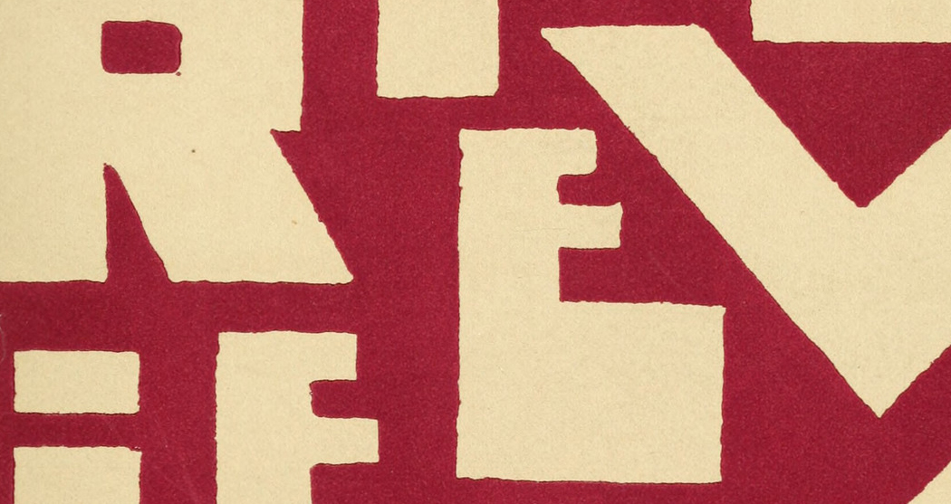
Yet another interesting textual aspect to graffiti and the community of graffiti artists is language that is unique to graffiti. Artists become skilled at reading the letters and understanding them, yet to an untrained eye they are often very difficult to decipher due to the extreme stylization of the letters. There are different styles that are constantly evolving, and the ability to read and communicate through these unique letters and symbols is a powerful method of textual control of an environment through art. Though a random bystander may well be able to appreciate the beautiful colors and stylistic lettering used in the graffiti works, other artists and those who know the community are able to recognize not only the tags and signatures of the artists, but also the unique message they are communicating. Many graffiti artists choose not only to communicate a message, but also to represent their group, and there are many examples of collaborative work amongst graffiti artists, where each individual contributes to the work as a whole in a rapid and expertly choreographed dance of spraypaint upon the wall.
A few examples of graffiti artist that share their work and process digitally:
Rake43 painting in an abandoned factory:
https://www.youtube.com/watch?v=J_Z-3SuFYJ8
GhostEA:
https://www.youtube.com/watch?v=IRYaPYFga3w